Preamble
If you're looking to design your own Ubuntu application icon, you can read/follow this guide I wrote kind-of as an extension of the official documentation.
I am also very pleased that this guide is featured in Ubuntu's developer documentation. 😊
Introduction
Often, an application icon is the first thing a user sees when they go to use or install your application, so every app needs a beautiful, memorable icon that attracts people to your app.
When designing an icon keep things simple and friendly and try not to make things too complex so that the end result is clear in communicating your app's intent.
May these guidelines help you as a starting point to ensure that your product icon, colors and key elements reflect your brand identity.
Grids
One of the most important aspects to designing an icon is adhering to a grid system (whether it's one on-paper/in-software or one in your head) to help insure design consistency.
The one I've devised here (for Ubuntu icon) is formed/based around elements of Suru icon design and the Ubuntu shape. So that any third-party icons created with it in mind fit in well with the core icon set.

Using a grid system to outline where to draw your icons' pictogram forces an area to be reserved for the background –essentially it ensures even padding around every pictogram so icons will look more consistent.
If you were wondering: the circular grid is larger due to the necessary overshoot for curved elements to compensate for the optical illusion of them looking smaller than square elements.
Some Examples
Here's how the grid system works with an icon from the default Suru icon set (left) and a one that I've designed (right) where you can see how each grid system guides the geometry of the pictogram for each icon.


The Unit Grid
It's also a good idea to design to an overall pixel/unit grid. I prefer to use grid units of with a base of 4 pixels in my vector graphics editor (Inkscape). The rationale here being that nearly every icon is displayed or at a size that is a multiple of 4 (48px, 512px, 1024px, etc.) so designing to such a grid makes for clean lines if an icon is to be resized.

Style & Shapes
The latest version of Suru uses entirely simple geometric shapes. The background is usually a solid-coloured surface with the pictogram, composed of flat shapes, "floating" above it.

Try not to add too many small details here or use text as it will likely be lost when the icon display due simply to the pixel density of the displays that these will be viewed on.
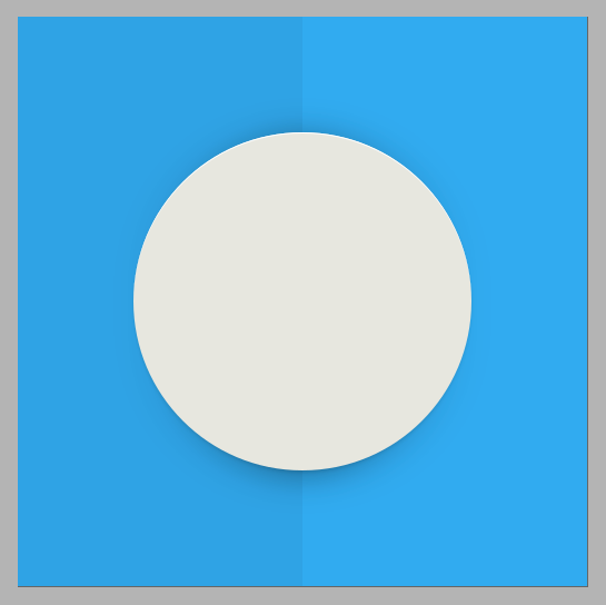
The Fold Effect
Some Suru icons have an implied fold in keeping with the origami style. In many icons this is a single horizontal or vertical line but sometimes the fold line(s) correspond or align with elements of the pictogram.


To draw the fold you simply create an overlay of a white or black polygon of very low opacity (1%-10%).


Colour
I won't say too much here, beyond: yes, use colour!
Reserve muted tones and greys for boring system icons. However be cognisant of your colour choices. For instance: red is usually associated with error or "danger" and orange with warnings –keep in mind the image you want to project when designing your icon.
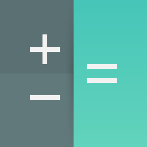
Gradients
You needn't worry about too much about the use of gradients in your icons either, nearly all elements can be designed with a single solid colour. If you were to add a gradient to your icon, only use colours that are slightly different from each other so that the change is not too dramatic. For example:
Shadows & Highlights
Sometime you may want a drop shadow on your icon's pictogram –i.e. if it's not intended to be flat against or part of the background. Generally, a Suru icon is drawn with two shadows, each in the shape of the pictogram to create a drop shadow effect.
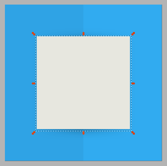
Simple Shadow
The first shadow is simply the central pictogram shape turned black and set to an opacity of 10%. It's then offset down by 2 pixels and 1% blur is applied.
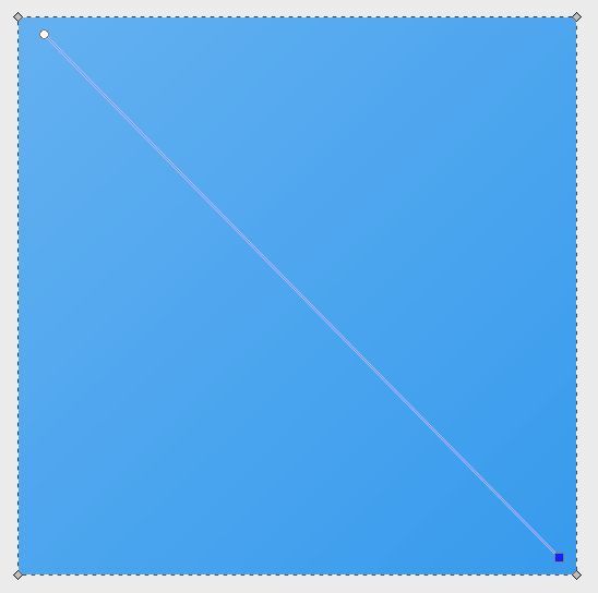
Fold Shadow
If I'm using a fold in the background of the icon I'll draw the second shadow with a linear gradient instead. This gradient is perpindicular to the fold line and has three stops –the first and last of which have a zero opacity. Then the entire shape is set to an opacity of 40% and a 10% blur is applied to it. It is then moved down 4 pixels to appear more prominent beneath the pictogram.
Essentially, this makes it darker in the area "under" the pictogram that would be "deeper" because of the implied fold.
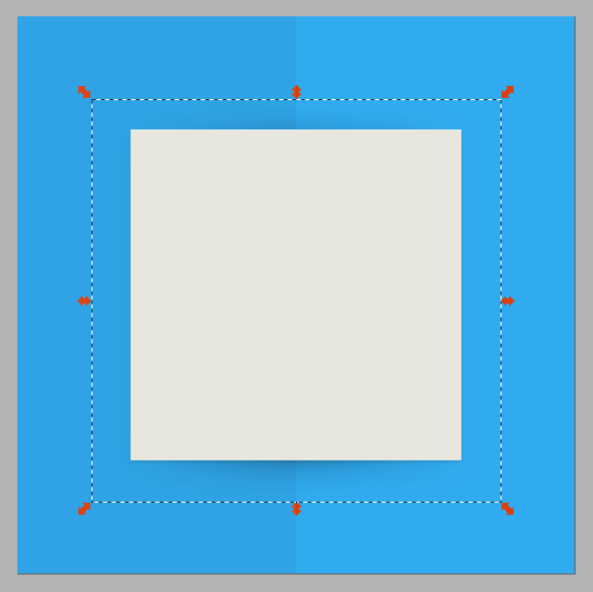
Highlights
Pictograms have an ever-so-slight (1 pixel) white highlight along the top edge of them. To do this simple make 2 solid white copies of the main pictogram shape and move one copy 1 pixel down and "difference" the two so what's left is an "edge" that you can align to the top of the pictogram. Repeat as needed.
Depending on the colour of your pictogram element, you can vary the opacity of your highlight. For instance, if it is using bright, primary colours, there isn't any need for a highlight.
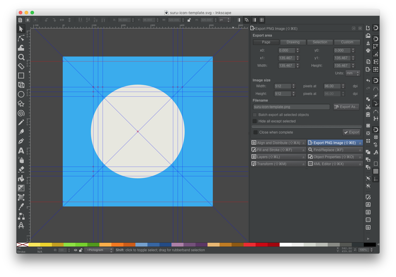
Template & Resource Kit
To make things moderately easier for you, I've created a Inkscape SVG template for creating a 512x512px Suru icon.
It uses layers for one for the background and another for the pictogram plus guides are included in the shape of the grid help with your design.
Download
If you like, you can also download said template or the seen-above grid asset and Ubuntu shape:
Template Grid Ubuntu Shape
Alternatively you can check out my Ubuntu Icon Resource Kit on GitHub, which has all of the above resources plus a few examples.
Contact
If you'd like to ask me anything, would like me to critique your icon, or would like to give feedback on this guide feel free to contact me. 😊