Some basic techniques to improve free software interfaces
Posted on 27 Aug 2019One of the most important steps of the design process is “usability testing”, it gives designers the chance to put themselves in other people’s shoes by gathering direct feedback from people in real time to determine how usable an interface may be. This is just as important for free and open source software development process as it is any other.
Though free software projects often lack sufficient resources for other more extensive testing methods, there are some basic techniques that can be done by non-experts with just a bit of planning and time—anyone can do this!
Free Software Usability
Perhaps notoriously, free software interfaces have long been unapproachable; how many times have you heard: “this software is great…once you figure it out.” The steep learning curve of many free software applications is not representative of how usable or useful it is. More often than not it’s indicative of free software’s relative complexity, and that can be attributed to the focus on baking features into a piece of software without regard for how usable they are.

Free software developers are often making applications for themselves and their peers, and the steps in development where you’d figure out how easy it is for other people to use—testing—gets skipped. In other words, as the author of the application you are of course familiar with how the user interface is laid out and how to access all the functionality, you wrote it. A new user would not be, and may need time or knowledge to discover the functionality, this is where usability testing can come in to help you figure out how easy your software is to use.
What is “Usability Testing”?
For those unfamiliar with the concept, usability testing is a set of methods in user-centric design meant to evaluate a product or application’s capacity to meet its intended purpose. Careful observation of people while they use your product, to see if it matches what it was intended for, is the foundation of usability testing.
The great thing is that you don’t need years of experience to run some basic usability tests, you need only sit down with a small group of people, get them to use your software, and listen and observe.
What Usability Testing is Not
Gathering people’s opinion (solicited or otherwise) on a product is not usability testing, that’s market research. Usability testing isn’t about querying people’s already formed thoughts on a product or design, it’s about determining if they understand a given function of a product or its purpose by having them use said product and gather feedback.
Usability is not subjective, it is concrete and measureable and therefore testable.
Preparing a Usability Test
To start, pick a series of tasks within the application that you want to test that you believe would be straightforward for the average person to complete. For example: “Set the desktop background” in a photos app, “Save a file with a new name” in a text editor, “Compose a new email” in an email client, etc. It is easiest to pick tasks that correspond to functions of your application that are (intended to be) evident in the user interface and not something more abstract. Remember: you are testing the user interface not the participant’s own ability to do a task.
You should also pick tasks that you would expect to take no more than a few minutes each, if participants fail to complete a task in a timely manner that is okay and is useful information.
Create Relatable Scenarios
To help would-be participants of your test, draft simple hypothetical scenarios or stories around these tasks which they can empathize with to make them more comfortable. It is very important in these scenarios that you do not use the same phrasing as present in the user interface or reference the interface as it would be too influential on the testers’ process. For instance, if you were testing whether an email client’s compose action was discoverable, you would not say:
Compose an email to your aunt using the new message button.
This gives too much away about the interface as it would prompt people to look for the button. The scenario should be more general and have aspects that everyone can relate to:
It’s your aunt’s birthday and you want to send her a well-wishes message. Please compose a new email wishing her a happy birthday.
These “relatable” aspects gives the participant something to latch onto and it makes the goal of the task clearer for them by allowing them to insert themselves into the scenario.
Finding Participants
Speaking of participants, you need at least five people for your test, after five there are diminishing returns as the more people you add, the less you learn as you’ll begin to see things repeat. This article goes into more detail, but to quote its summary:
Elaborate usability tests are a waste of resources. The best results come from testing no more than 5 users and running as many small tests as you can afford.
This is not to say that you stop after a single test with five individuals, it’s that repetitive tests with small groups allow you to uncover problems that you can address and retest efficiently, given limited resources.
Also, the more random the selection group is, the better the results of your test will be—“random” as if you grabbed passers-by the hallway or on the street. As a bonus, it’s also best to offer some sort of small gratuity for participating, to motivate people to sign up.
Warming Up Participants
It’s also important to not have the participants jump into a test cold. Give participants some background and context for the tests and brief them on what you are trying to accomplish. Make it absolutely clear that the goal is to test the interface, not them or their abilities; it is very important to stress to the participants that their completion of a task is not the purpose of the test but determining the usability of the product is. Inability to complete a task is a reflection of the design not of their abilities.
Preliminary Data Gathering
Before testing, gather important demographic information from your participants, things like age, gender (how they identify), etc. and gauge their level of familiarity with or knowledge of the product category, such as: “how familiar are you with Linux/GNOME/free software on a scale from 1-5?” All this will be helpful as you break down the test results for analysis to see trends or patterns across test results.
Running the Test
Present the scenarios for each task one at a time and separately as to not overload the participants. Encourage participants to give vocal feedback as they do the test, and to be as frank and critical as possible as to make the results more valuable, assuring them your feelings will not be hurt by doing so.
During the task you must but attentive and observe several things at once: the routes they take through your app, what they do or say during or about the process, their body language and the problems they encounter—this is where extensive note-taking comes in.
No Hints!
Do not interfere in the task at hand by giving hints or directly helping the participant. While the correct action may be obvious or apparent to you, the value is in learning what isn’t obvious to other people.
If participants ask for help it is best to respond with guiding questions; if a participant gets stuck, prompt them to continue with questions such as “what do you think you should do?” or “where do you think you should click?” but if they choose not finish or are unable to, that is okay.
Be Watchful
The vast majority of stumbling blocks are found by watching the body language of people during testing. Watch for signs of confusion or frustration—frowning, squinting, sighing, hunched shoulders, etc.—when a participant is testing your product and make note of it, but do not make assumptions about why they became frustrated or confused: ask them why.
It is perfectly alright to pause the test when you see signs of confusion or frustration and say:
I noticed you seemed confused/frustrated, care to tell me what was going through your mind when you were [the specific thing they were doing]?
It’s here where you will learn why someone got lost in your application and that insight is valuable.
Take Notes
For the love of GNU, pay close attention to the participants and take notes. Closely note how difficult a participant finds a task, what their body language is while they do the task, how long it takes them, and problems and criticisms participants have. Having participants think aloud or periodically asking them how they feel about aspects of the task, is extremely beneficial for your note-taking as well.
To supplement your later analysis, you may make use of screen and/or voice-recording during testing but only if your participants are comfortable with it and give informed consent. Do not rely on direct recording methods as they can often be distracting or disconcerting and you want people to be relaxed during testing so they can focus, and not be wary of the recording device.
Concluding the Test
When the tasks are all complete you can choose to debrief participants about the full purpose of the test and answer any outstanding questions they may have. If all goes well you will have some data that can be insightful to the development of your application and for addressing design problems, after further analysis.
Collating Results
Usability testing data is extremely useful to user experience and interaction designers as it can inform our decision-making over interface layouts, interaction models, etc. and help us solve problems that get uncovered.
Regardless of whether the testing and research is not conducted ourselves, it’s important that the data gathered is clearly presented. Graphs, charts and spreadsheets are incredibly useful in your write-up for communicating the break down of test results.
Heat Maps
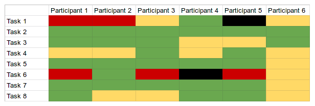
It helps to visualize issues with tasks in a heat map, which is an illustration that accounts for the perceived difficulty of a given task for each participant by colour-coding them in a table.

The above is a non-specific example that illustrates how the data can be represented: green for successful completion of the task, yellow for moderate difficulty, red for a lot of difficulty, and black for an incomplete. From this heat map, we can immediately see patterns that we can address by looking deeper in the results; we can see how “Task 1” and Task 6” presented a lot of difficulty for most of the participants, and that requires further investigation.
More Usable Free Software
Conducting usability testing on free software shouldn’t be an afterthought of the development process but rather it should be a deeply integrated component. However, the reality is that the resources of free software projects (including large ones like GNOME) are quite limited, so one of my goals with this post is to empower you to do more usability testing on your own—you don’t have to be an expert—and to help out and contribute to larger software projects to make up for the limits on resources.
Usability Testing GNOME
Since I work on the design of GNOME, I would be more than happy to help you facilitate usability testing for GNOME applications and software. So do not hesitate to reach out if you would like me to review your plans for usability testing or to share results of any testing that you do.
Further Reading
If you’re interested in more resources or information about usability, I can recommend some additional reading:
- Jim Hall, in Linux Journal: It’s about the User: Applying Usability in Open-Source Software
- Jan-Christoph Borchardt’s thesis on Usability in Free Software
- More on usability and User Experience: usability.gov
- Work of of Jakob Nielsen et al.: Nielsen Norman Group